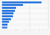
| Characteristic | Frustration score* |
|---|---|
| - | - |
| - | - |
| - | - |
| - | - |
| - | - |
| - | - |
| - | - |
| - | - |
| - | - |
| - | - |
The chart is not accessible to screen readers. Please switch to the table view to access the data.
November 2014
Canada, United States
September to November 2014
3,000+
travelers who have taken at least one round-trip in the past year
Online survey
* 0 = least frustrating, 100 = most frustrating.
The rankings were compiled using the following data:
Survey (40 percent weight): respondents were asked to rate their most recent airport experience in the U.S. or Canada on a scale of one to ten for travel times, check-in and security (50 percent weight); gate area, seating and restrooms ( 25 percent weight); and restaurants, shopping and terminal layout (25 percent weight).
On-time performance (40 percent weight): data from the Bureau of Transportation Statistics and Airport Factsheets for the year July 2013 to July 2014 was used to determine the share of flights cancelled (50 percent weight); share of flights arriving and departing on time (25 percent weight); and the average delay in minutes (25 percent weight).
Getting to and from the airport (20 percent weight): Google Maps data was used to determine the driving time (50 percent weight) and the public transportation time (50 percent weight) to and from the airport to the airport's primary city center.
Only the 36 U.S. and Canadian airports which received more than 30 reviews were included in the rankings.